gganimate: Animate YouR Security Analysis
I regularly challenge myself and others to visualize the results of their analysis, when and where the data permits it. The likes of ggplot2 enables this beautifully for R users. Then, in September 2018, gganimate hit my radar via R-bloggers and I had an epiphany.
“gganimate extends the grammar of graphics as implemented by ggplot2 to include the description of animation. It does this by providing a range of new grammar classes that can be added to the plot object in order to customize how it should change with time.”
While Thomas’s gganimate examples are intriguing, and triggered my notions for deeper visualization opportunities, they were contextually unrelated to my goals. As such, I endeavored to provide example data sets and applicability for information security and assurance analysis. As purveyors of security analysis services, my team is perpetually faced with solving problems at massive scale, yet finding intelligent, accurate answers in the sea of data. While a static visualization specific to a related analysis can be truly effective, an animated visualization, particularly a time-based graphic, can bring the art to a whole new level. A couple of points and caveats:
- This review drove me a bit crazy over the nuance between security analysis versus security analytics. In the end, I settled on the fact that this work enables analysis, based on the Merriam-Webster definitions:
- Analysis is “a detailed examination of anything complex in order to understand its nature or to determine its essential features: a thorough study.”
- Analytics is defined as “the method of logical analysis.” The Electronic Engineering Times elaborates further: “Merriam-Webster’s definition of analytics as a “method of logical analysis” includes the term analysis, but introduces a significant differentiator with the term “logical.” Analytic methods use data to answer questions that occurred in the past, but also provide insights or deductive reasoning to act in the future.” In my mind, static and animated visualizations of data past are more an “examination of anything complex in order to understand its nature or to determine its essential features”. Yet, one can argue that these same visualizations can, at least, help inform action in the future. It came out to be approximately a 70⁄30 split for me, in favor of analysis. Let the debate begin, but this gives you good insight regarding the discussions I have with myself. ;-)
- While the data sets provided here are artificial, they are based on absolute realities, and represent legitimate scenarios and likely outcomes. That said, they are artificial (#FakeData) so please do not use this data to influence any decisions other than to use these methods with your real data. The goal here is simply to provide you with hopefully new and innovative ways to represent your analysis.
gganimate installation is really simple. You can grab the stable version from CRAN via
install.packages('devtools')
or the development version via
devtools::install_github('thomasp85/gganimate')
Note that, while working on Windows 10, I used a gganimate fork via
devtools::install_github("dmi3kno/gganimate")
to overcome a Windows 10-specific bug. Installation from CRAN or the thomasp85 GitHub should be otherwise successful. I strongly suggest reading through as much of the gganimate reference guide, as a Grammar of Animated Graphics, there is some granular syntax to consume and understand here.
I selected three of Thomas’s examples and customized them for use in a security analysis context. Thomas is gganimate’s author and maintainer, for a very current review of the project’s history, current state, and road map, see gganimate has transitioned to a state of release. The project is now officially a v1.0 release. The project GitHub includes three examples:
I utilized the principles and code from each of these and applied them to three unique security-oriented scenarios, namely security incident counts over time, a cloud provider Cybersecurity Framework attestation comparison, and ten years of Security Development Lifecycle utilization.
Security Incidents Time Series
I’ll start with a simple example and concept. I’m not a big fan of security incident counts by themselves as a metric or a KPI, but they do inform trend indicators. For large service providers and operations, data of this nature can inform leadership of patterns to manage as well. This visualization compares incident counts by day of the month, over five months August through December, in parallel, as seen in Figure 1.
library(ggplot2)
library(gganimate)

incidents <- read.csv("incidents.csv")
incidents$Month <- format(ISOdate(2004,1:12,1),"%B")[incidents$Month]

p <- ggplot(incidents, aes(Day, Inc_Cnt, group = Month)) +
  geom_line(aes(colour=Month)) +
  geom_segment(aes(xend = 31, yend = Inc_Cnt), linetype = 2, colour = 'blue') +
  geom_point(size = 2) +
  geom_text(aes(x = 31.1, label = Month), hjust = 0, colour = 'brown') +
  transition_reveal(Month, Day) +
  coord_cartesian(clip = 'off') +
  labs(title = 'Incident Counts by Day - AUG through DEC', y = 'Incident Count') +
  theme_minimal() +
  theme(plot.margin = margin(5.5, 40, 5.5, 5.5)) +
  theme(legend.position='none')
p + anim_save("incidentTS.gif", animation = last_animation())
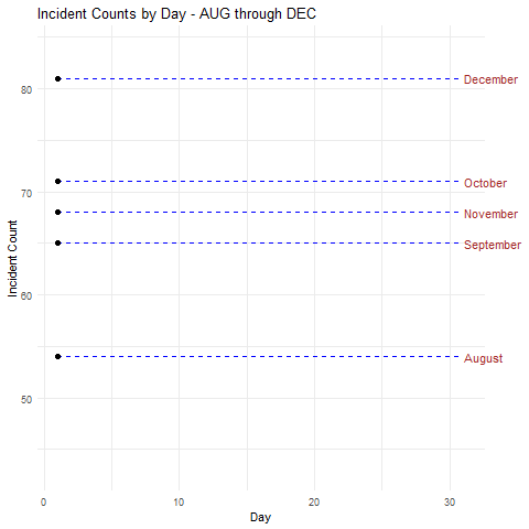
Figure 1: Security incidents time series
One could reach conclusions such as:
- Incident counts are above the median in all but August at the beginning of month
- In all but October there were noteworthy dips in security incidents on on or about the 17th of the month
Were this real data specific to the environment you’re supporting you might adjust scheduling and staffing to account for a heavier work load at the beginning of the month, while potentially pushing scheduled time off to the middle of the month.
Cloud Provider Cybersecurity Framework (CSF) Attestation Comparison
For our second scenario, imagine you’re in the market for a cloud service provider, and you’re charged with conducting the utmost due diligence. It just so happens that The Cloud Security Alliance (CSA) Cloud Controls Matrix (CCM) is “designed to provide fundamental security principles to guide cloud vendors and to assist prospective cloud customers in assessing the overall security risk of a cloud provider. The CSA CCM provides a controls framework that gives detailed understanding of security concepts and principles that are aligned to tools including the Cybersecurity Framework.” The CSF is oriented towards the function areas Identify, Protect, Detect, Respond, and Recover. With a combination of cloud service provider data, as well as your own research, you gathered data to measure provider performance in each of the function area over the period of a year. Your data is refined to a percentage of completeness towards each of the function areas for the twelve months of the year for your final two provider candidates. The code to create this visualization follows.
library(dplyr)
library(ggplot2)
library(gganimate)

cldprvdr_data <- read.csv("CloudProvidersCSF.csv") %>%
  mutate(control = factor(control, levels = c("Identify", "Protect", "Detect", "Respond", "Recover")))

control_color <- c(
  "Identify" = "#1a9fde",
  "Protect" = "#e10b1f",
  "Detect" = "#565656",
  "Respond" = "#727272",
  "Recover" = "#499533"
)

cp_animated <- ggplot(cldprvdr_data, aes(x = control, y = result, fill = control)) +
  geom_hline(yintercept = 0.05, colour = "#D3D3D3", linetype = "dashed") +
  geom_bar(position = "dodge", stat = "identity") +
  #geom_text(aes(label = scales::percent(result),
  #              y = result + 0.01),
  #          position = position_dodge(width = 0.9),
  #          vjust = -0.5, size = 6, color = "black") +
  labs(title = "2018 CSF attestation per month: {closest_state}",
       subtitle = "Cyber Security Framework (CSF) results per Cloud Provider",
       caption = "CSF function areas: Identify, Protect, Detect, Respond, Recover",
       x = "", y = "") +
  theme_light(base_size = 16) +
  guides(fill = FALSE) +
  facet_grid(cldprvdr ~ .) +
  scale_y_continuous(labels = scales::percent, limits = c(0, 1)) +
  scale_fill_manual(values = control_color) +
  transition_states(month, 1,3, wrap = FALSE) +
  ease_aes('quadratic-in-out')
cp_animated + anim_save("CloudProvidersCSF.gif", animation = last_animation())
Visualizing this data with gganimate for purposes of comparison thus might appear as seen in Figure 2.
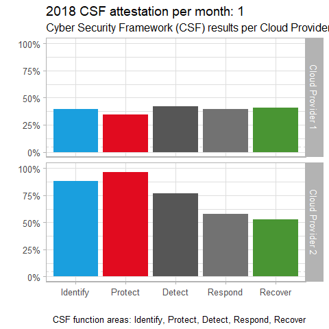
Figure 2: Cloud providers CSF comparison
There’s a pretty clear conclusion to be reached with this visualization. It certainly appears that Cloud Provider 2 is the more mature of the two providers, by at least 20% per function area. A visualization of this nature for vendor comparisons of many different kinds could be very useful in making better informed decision, particularly when they’re large financial investments.
Ten Years of Security Development Lifecycle Utilization
I’m personally fond of this last example as I am both a proud advocate for the practice of a Security Development Lifecycle and a believer that this level of performance measurement granularity can and should be performed. I have to imagine mature development environments with strong code management capabilities are likely able to achieve some semblance of this scenario. The premise of the data set assumes a ten year measurement where aggregate development organizations have tracked:
- lines of code to measure code base growth and potential bloat
- the number of bugs submitted or detected
- the number of code regressions
Each of these are valid and important measurements and KPIs for development organizations, nor matter what product is being developed. This data set represents measurements across multiple applications, built for all major platforms (Windows, Linux, Android, iOS, Mac), over a ten year period since the organization began utilizing SDL. First, the code.
library(ggplot2)
library(gganimate)
library(tibble)

data <- read.csv("SDL.csv")
sdl_data <- as_data_frame(data)

options(scipen=10000)
dev.off(which = dev.prev())

ggplot(sdl_data, aes(bugs, regressions, size = code, colour = apps)) +
  geom_point(alpha = 0.7) +
  scale_colour_manual(values = rainbow(n=142)) +
  scale_size(range = c(2, 12)) +
  scale_x_log10() +
  facet_wrap(~OS) +
  theme(legend.position = 'none') +
  labs(title = 'Year: {frame_time}', x = 'Bugs', y = 'Regressions',
       subtitle = "Ten Years of SDL") +
  transition_time(year)
The resulting visualization warrants a bit of explanation. This size of each node (application) in the five major platform panes panes represents is indicative of the size of the application’s code base. The x axis represents the number of bugs filed, and the y axis represents the number of regressions introduced, as seen in Figure 3.
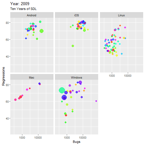
Figure 3: Ten Years of SDL
A few observations:
- The largest apps are found in the Windows groupings, you can watch their code size grow in small margins as the years progress, and while the bugs reported increase as expected with code growth, the regressions decline gradually
- Linux apps tended to perform best over time, relatively stable with minor code growth, almost no increase in bugs over time, and some noteworthy declines in regressions are observed
- Only a very few apps, in the Windows and Linux collections, performed really well over time, with minimal bugs and regressions, yet a steady decrease in both, even with observable code growth
- Most of the Android apps remain high in bugs and regressions until half way through the decade, then decrease in regression, but the largest app shows now improvement at all, it even worsens.
While again, this is artificial, manipulated data, I tried to cook it in such a manner as to produce likely outcomes that would be well observed with animated visualizations over time.
I do hope this has stimulated your thinking on these types of scenarios, and ideally, the additional plethora opportunities to bring animation to your security data.
Each of these scripts and data sets are available for you on my GitHub, as is a Jupyter Notebook.
https://github.com/holisticinfosec/gganimate-Animate-YouR-Security-Analysis
I’d love to see what you come up with, please share them with me via social media, @holisticinfosec or email, russ at holisticinfosec dot io.
Cheers…until next time.


Comments