Exploratory Data Analysis with CISSM Cyber Attacks Database - Part 1
Part 1 of 2
Introduction
Exploratory data analysis (EDA) is a mission critical task underpinning the predominance of detection development and preparation for cybersecurity-centric machine learning. There are a number of actions that analysts can take to better understand a particular data set and ready it for more robust utilization. In the spirit of toolsmith, consider what follows a collection of tools for your security data analytics tool kit.
The University of Maryland’s Center for International and Security Studies (CISSM) Cyber Attacks Database is an ideal candidate for experimental exploration. Per the dataset description, the database “brings together open-source information surrounding a range of publicly acknowledged cyber events on private and public organizations. Events from 2014 through present have been coded to standardize information on threat actor, threat actor country, motive, target, end effects, industry, and country of impact. Source links to the news source are also provided” (Harry & Gallagher, 2018). I asked the project’s principal investigators for data export access as the default UI content is not suited to raw ingestion. The resulting cissm-export.csv (through MAR 2023) file, and all of the code that follows, as well as a Jupyter/Colab notebook for convenient experimentation, are available to you via my CISSM-EDA repository.
We begin with with loading the necessary libraries, data ingestion, data frame construction (tibble), and tsibble creation, a time series tibble. Our series of experiments require correlationfunnel, devtools, forecast, fpp2, CGPfunctions, ggpubr, janitor, tidyverse, tsibble, TTR, and vtree. The following snippet installs packages only if needed. Note that we’re installing dataxray from my fork in order to take advantage of an update I made to the report_xray() function. This update enables the results of a dataxray report to render in a browser automatically, particularly useful when calling the function from a Jupyter/Colab notebook.
my_packages <- c("correlationfunnel", "devtools", "forecast", "fpp2", "CGPfunctions",
"ggpubr", "janitor", "tidyverse", "tsibble", "TTR", "vtree")                            # Specify your packages
not_installed <- my_packages[!(my_packages %in% installed.packages()[ , "Package"])]    # Extract packages to be installed
if(length(not_installed)) install.packages(not_installed)                               # Install packages
devtools::install_github("holisticinfosec/dataxray")                                    # Install dataxray
With packages installed, we call libraries and build important components for our exercises. Comments are inline for each step.
# Attach the requisite packages

library(dataxray)
library(forecast)
library(fpp2)
library(CGPfunctions)
library(ggpubr)
library(janitor)
library(tidyverse)
library(tsibble)
library(TTR)
library(vtree)

# ingest the CISSM CAD data as a data frame

df <- read_csv("CISSM-export.csv", show_col_types = FALSE)

# shrink the data set to include only event dates and event types

evtType <- tabyl(df, evtDate, event_type)

# convert the reduced data frame to a tibble

df1 <- as_tibble(evtType)

# create an all events tsibble

df1 |>
  mutate(evtDate = yearmonth(evtDate)) |>
  as_tsibble(index = evtDate) -> AllEvents

# create disruptive events tsibble
AllEvents |> select(evtDate,Disruptive) -> disruptive

# create exploitative events tsibble
AllEvents |> select(evtDate,Exploitative) -> exploitative
The disruptive and exploitative variables will be used later as we model, forecast, and plot the results.
We’ll take advantage of the df variable for dataxray, janitor, CGPfunctions, and vtree.
dataxray
dataxray is an interactive table interface for data summaries. It provides an excellent, interactive first look at the data set. I set a specific working directory in my script, set yours as you see fit.
df %>%
  make_xray() %>%
  view_xray()

df %>%
  report_xray(data_name = 'CISSM', study = 'ggplot2')
The result is a columnar view of the CISSM Cyber Attacks Database with variables, observations including missing and distinct data, and interactive figures per variable. The view_xray() function creates an RStudio IDE Viewer pane while report_xray() generates the same result as RMD and HTML files written to your local directory. I’ve hosted the HTML version here if you’d like to interact with it without having to run the analyses yourself.
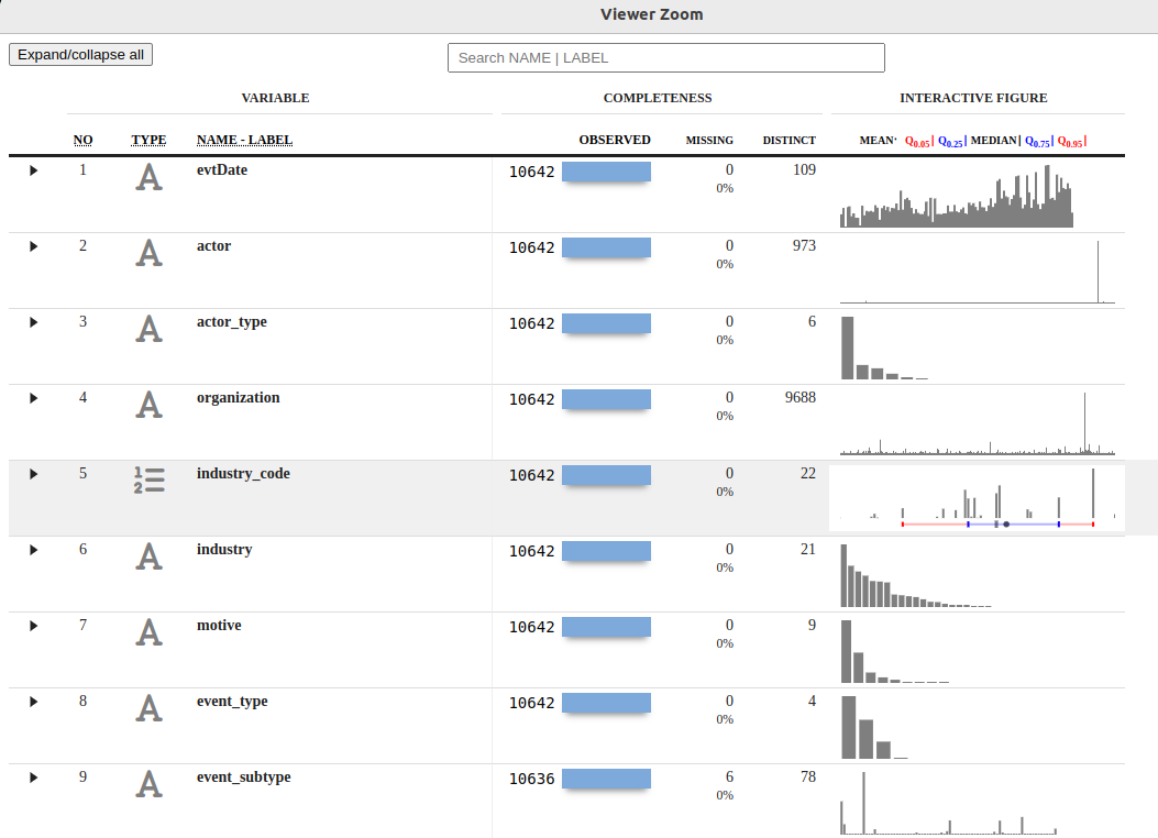
Figure 1: CISSM CAD dataxray
We learn quickly that the data include 10642 observations and 13 variables.
Of 10642 observations, there are 109 months of data, with 973 unique actors, six actor types, nine motives, four event types and plethora others. Hovering over the interactive figures we discover that motives include espionage, financial, industrial-espionage, personal attack, political-espionage, protest, protest-financial, sabotage, and undetermined. We also learn that event types include disruptive, exploitative, mixed, and undetermined. More on this next where we use janitor to manipulate this data further. dataxray is a great opening salvo in your analysis attack, fulfilling descriptive statistics capabilities admirably.
janitor, CGPfunctions, and vtree
While looking for improved methods to count by group in R I discovered janitor via Sharon’s Infoworld article including “quick and easy ways to count by groups in R, including reports as data frames, graphics, and ggplot graphs” (Machlis, 2020).
janitor includes simple little tools for “examining and cleaning dirty data, including functions that format ugly data.frame column names, isolate duplicate records for further study, and provide quick one- and two-variable tabulations (i.e., frequency tables and crosstabs) that improve on the base R function table().”
The CISSM CAD data sets up perfectly for a variety of table views with counts and/or percentages. While base R’s table() and dplyr’s count() are perfectly useful, a little enrichment never hurt anyone.
As you can see, table and count perform perfectly well.
>table(df$event_type)

  Disruptive Exploitative        Mixed Undetermined
        3462         5561         1525           94

>df %>%
+   count(event_type)
    event_type    n

1   Disruptive 3462
2 Exploitative 5561
3        Mixed 1525
4 Undetermined   94
What table and count don’t necessarily provide are the aforementioned enrichment, but tabyl and janitor’s adorn functions fill that void nicely.
First, basic tabyl use yields quick results as seen in the partial output snippet below.
>tabyl(df, event_type, motive)

   event_type Espionage Financial Industrial-Espionage Personal Attack Political-Espionage Protest Protest,Financial Sabotage Undetermined
   Disruptive         0      1335                    0              27                   6     643                 0      240         1211
 Exploitative        25      3077                   86              64                 497     282                 0       42         1488
        Mixed         0      1361                    2               2                  14      41                 1       16           88
 Undetermined         0        57                    0               0                   2       2                 0        1           32
If we chose to adorn our results however the result is all the more beneficial.
>tabyl(df, event_type, motive) %>%
+   adorn_percentages("col") %>%
+   adorn_pct_formatting(digits = 1)

   event_type Espionage Financial Industrial-Espionage Personal Attack Political-Espionage Protest Protest,Financial Sabotage Undetermined
   Disruptive      0.0%     22.9%                 0.0%           29.0%                1.2%   66.4%              0.0%    80.3%        43.0%
 Exploitative    100.0%     52.8%                97.7%           68.8%               95.8%   29.1%              0.0%    14.0%        52.8%
        Mixed      0.0%     23.3%                 2.3%            2.2%                2.7%    4.2%            100.0%     5.4%         3.1%
 Undetermined      0.0%      1.0%                 0.0%            0.0%                0.4%    0.2%              0.0%     0.3%         1.1%
Continuing our journey with event types and motives, a similar construct can be visualized using CGPfunctions.
Per the CGPfunctions description, it’s a package that includes miscellaneous functions useful for teaching statistics as well as actually practicing the art. They typically are not new methods but rather wrappers around either base R or other packages. In this case, we’ll use PlotXTabs2 which wraps around ggplot2 to provide bivariate bar charts for categorical and ordinal data, specifically the event_type and motive variables.
PlotXTabs2(df, event_type, motive, title = "Event Type by Motive")
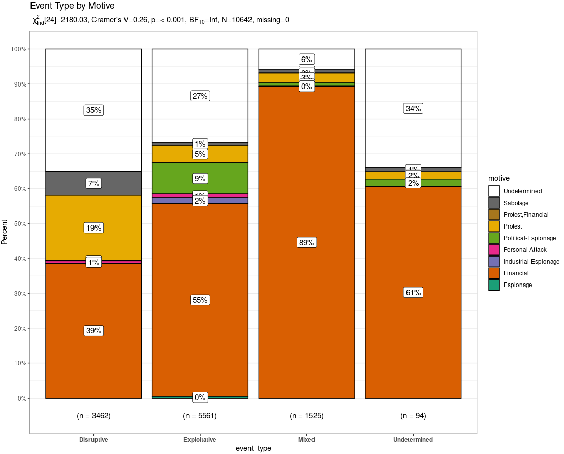
Figure 2: CISSM CAD PlotXTabs2
PlotXTabs2 stands out as it offers a summary of key frequentist and bayesian information as a subtitle (can be suppressed) as well as a plethora of formatting options courtesy of ggstatsplot (Powell, 2020). Noteworthy in the resulting plot is the fact that across all event types (disruptive, exploitative, mixed, undetermined) the predominant motive was financial. Not surprising, but noteworthy. Regardless, PlotXTabs2 provides an incredibly useful visualization of the CAD dataset with specific variables.
Finally, we conclude this section with use of the vtree package. vtree, or variable trees, displays information about nested subsets of a data frame, in which the subsetting is defined by the values of categorical variables. This is again a perfect option for our subsetted CISSM CAD data. First, we generate a simple vtree based only on event type.
vtree(df, "event_type")
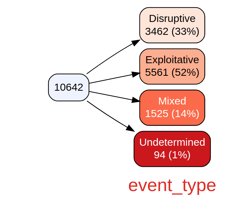
Figure 3: CISSM CAD event type vtree
The result includes a breakdown of event types from the total of 10642 events, including counts and percentage. If you prefer a view without counts you can exclude them as follows; in this case we do so with motives. Note that vtree is incredibly rich with argument features, tailor your visualizations to your liking. Call help("vtree") to learn more.
vtree(df, "motive", showcount = FALSE)
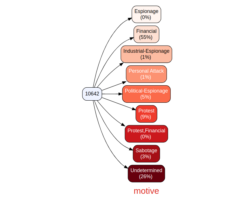
Figure 4: CISSM CAD motive vtree
Finally, we join event types and motives, and pivot our tree to be read vertically.
vtree(df, c("event_type", "motive"), showcount = FALSE, horiz = FALSE)

Figure 5: CISSM CAD vertical event types and motives vtree
The more data you join, the more unwieldy the tree becomes, but nonetheless an intriguing view when zoomed appropriately.
We'll continue this exploratory data analytics journey with forecasting models and plots to show how you might predict future attack volumes. Feel free to drop questions in comments or ping me via socials.
Cheers…until next time.
Russ McRee | @holisticinfosec | infosec.exchange/@holisticinfosec | LinkedIn.com/in/russmcree
References
Acharya, S. (2021, June 15). What are RMSE and Mae? Medium. Retrieved May 3, 2023, from https://towardsdatascience.com/what-are-rmse-and-mae-e405ce230383
Harry, C., & Gallagher, N. (2018). Classifying cyber events. Journal of Information Warfare, 17(3), 17-31.
Machlis, S. (2020, September 10). How to count by group in R. InfoWorld. Retrieved May 1, 2023, from https://www.infoworld.com/article/3573577/how-to-count-by-groups-in-r.html
Nau, R. (2020, August 8). Introduction to ARIMA models. Statistical forecasting: notes on regression and time series analysis. Retrieved May 4, 2023, from https://people.duke.edu/~rnau/411arim.htm#pdq
Powell, C. (2020, November 12). Using PlotXTabs2. The Comprehensive R Archive Network. Retrieved May 2, 2023, from https://cran.r-project.org/web/packages/CGPfunctions/vignettes/Using-PlotXTabs2.html


Comments