Metrics and SPAM
|
|
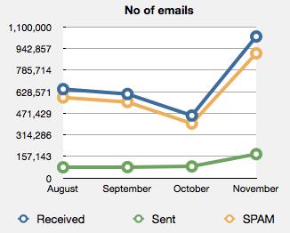
Like all good security people I regularly look at different metrics to see what is going on in the environment. Usually this is a bit of a ho hum task, but every now and then you do come across something interesting. I find it helps to graphically represent the information as abnormalities often jump out at you which otherwise might not be as obvious. Take the graph on the left. This represents the SPAM traffic received in a month. August and September are fairly steady a noticeable drop in October in email received and then, Whoa! What is going on in November? Email messages received increased by more than 100% and the yellow line shows that the majority is SPAM. It is not exactly parallel to the received line so either normal mail increased as well or more SPAM was missed by the tool used to block SPAM. Both are worth investigating further. Metrics, especially visualised metrics, can be very effective in identifying whether you need to jump and fix something or whether it is business as usual. |
Now all of you use some form of metrics in your organisation for security and I can guarantee that others are looking for useful metrics that they can apply in their environment. So if you are using a nifty metric that is easy to obtain and you are willing to share with the rest of us let us know.
(On a second note, if you SPAM increased by similar numbers in November, I'd be interested as well)
Mark H - Shearwater


Comments